- works
- "BuyTheDip"
"BuyTheDip"
The company name "BuyTheDip" is inspired by a popular financial strategy that involves purchasing securities at their lowest cost. This concept is reflected in the brand's symbol—a stylized price chart that illustrates a drop followed by a sharp rise. This visual representation not only captures the essence of the strategy but also conveys a sense of smart, opportunistic investment, appealing to savvy investors.
The 'BuyTheDip' logo radiates confidence and optimism, capturing the essence of market dynamics. The stylized graph not only symbolizes a dip and swift recovery but also instills in investors a sense of the perfect timing for action.
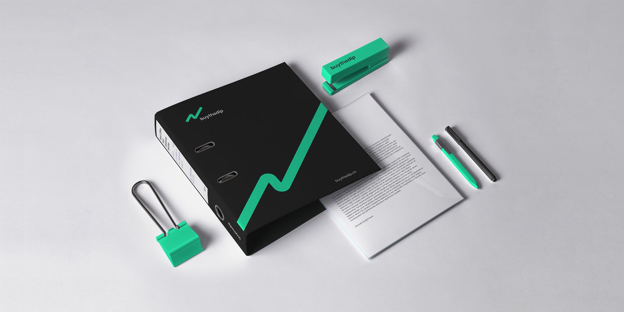
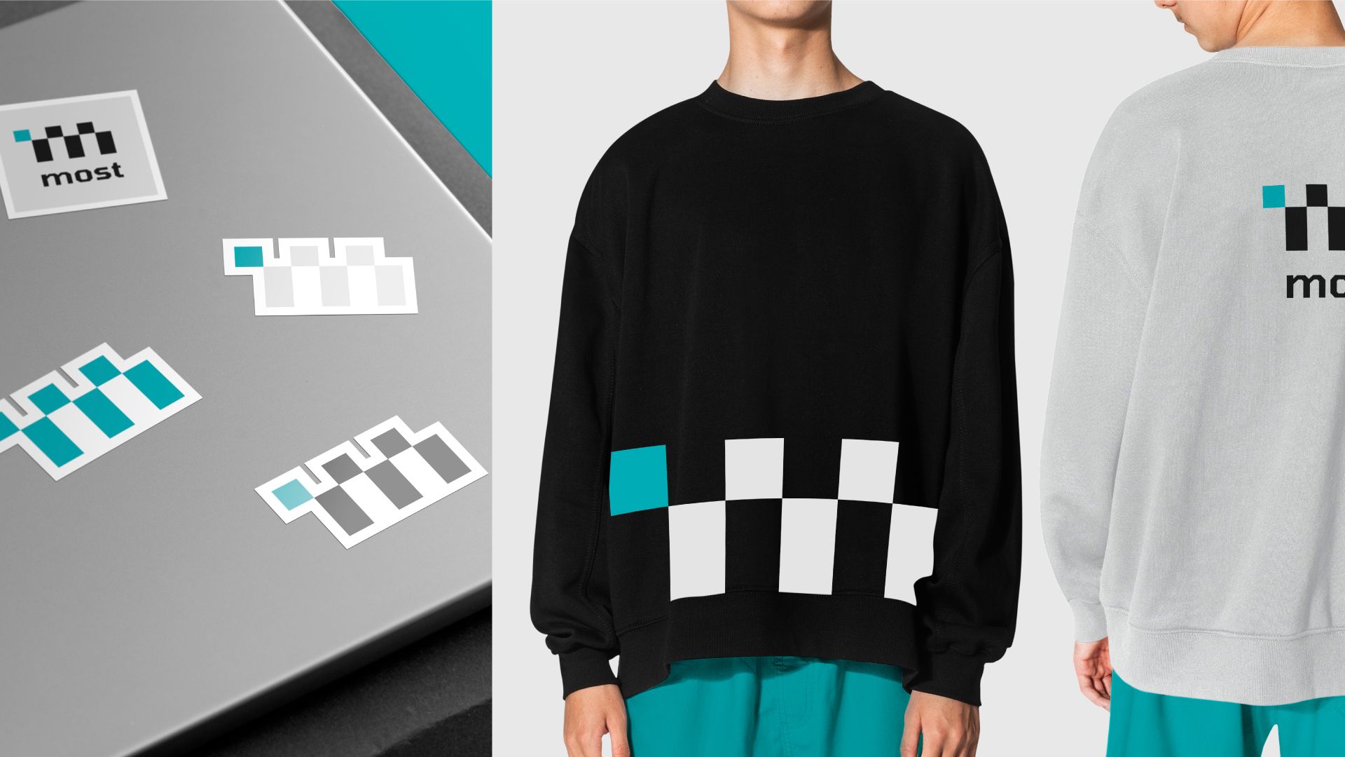
We have developed comprehensive brand guidelines that detail all the rules for creating layouts. This ensures consistency when working with the logo and corporate identity.
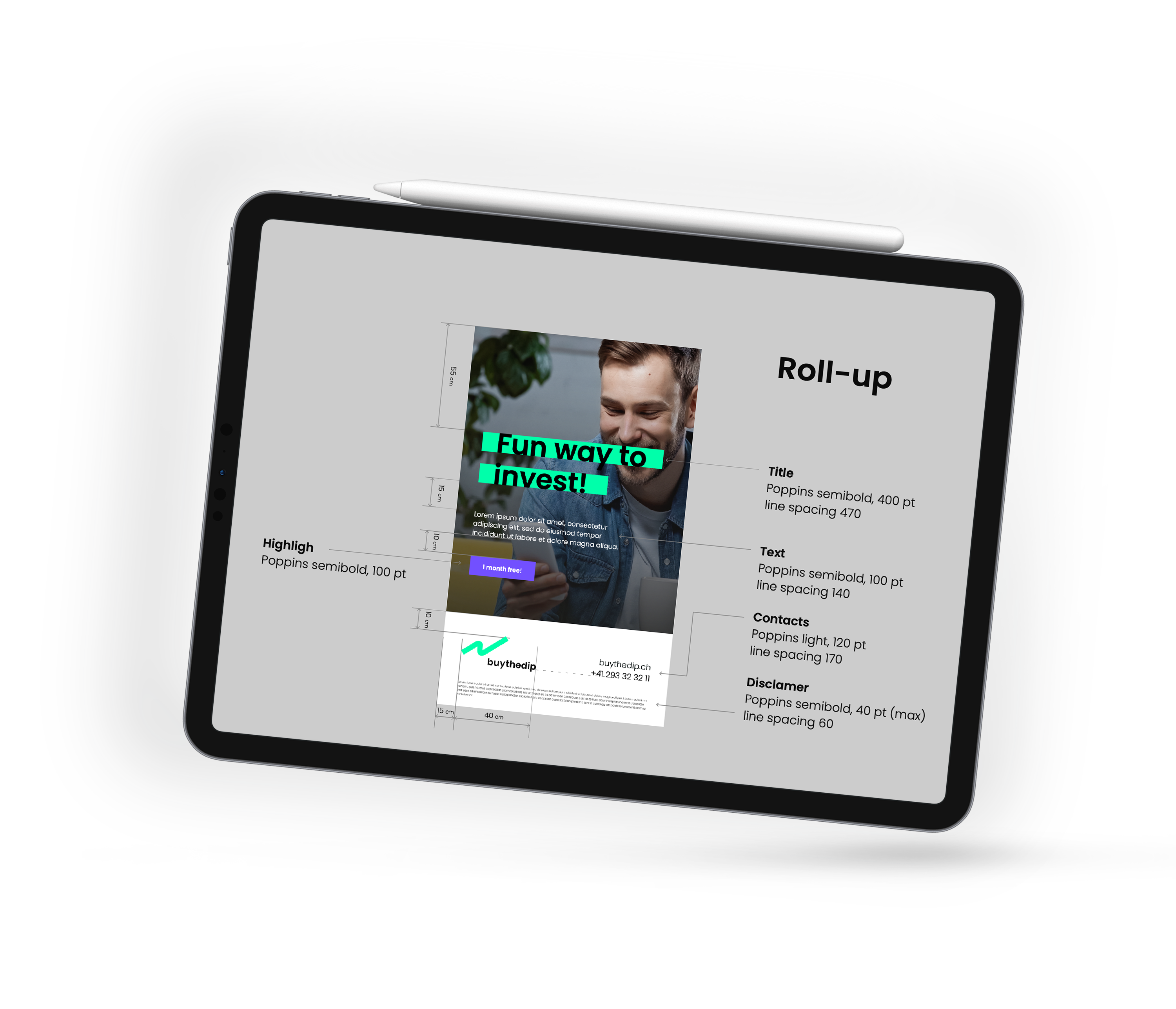
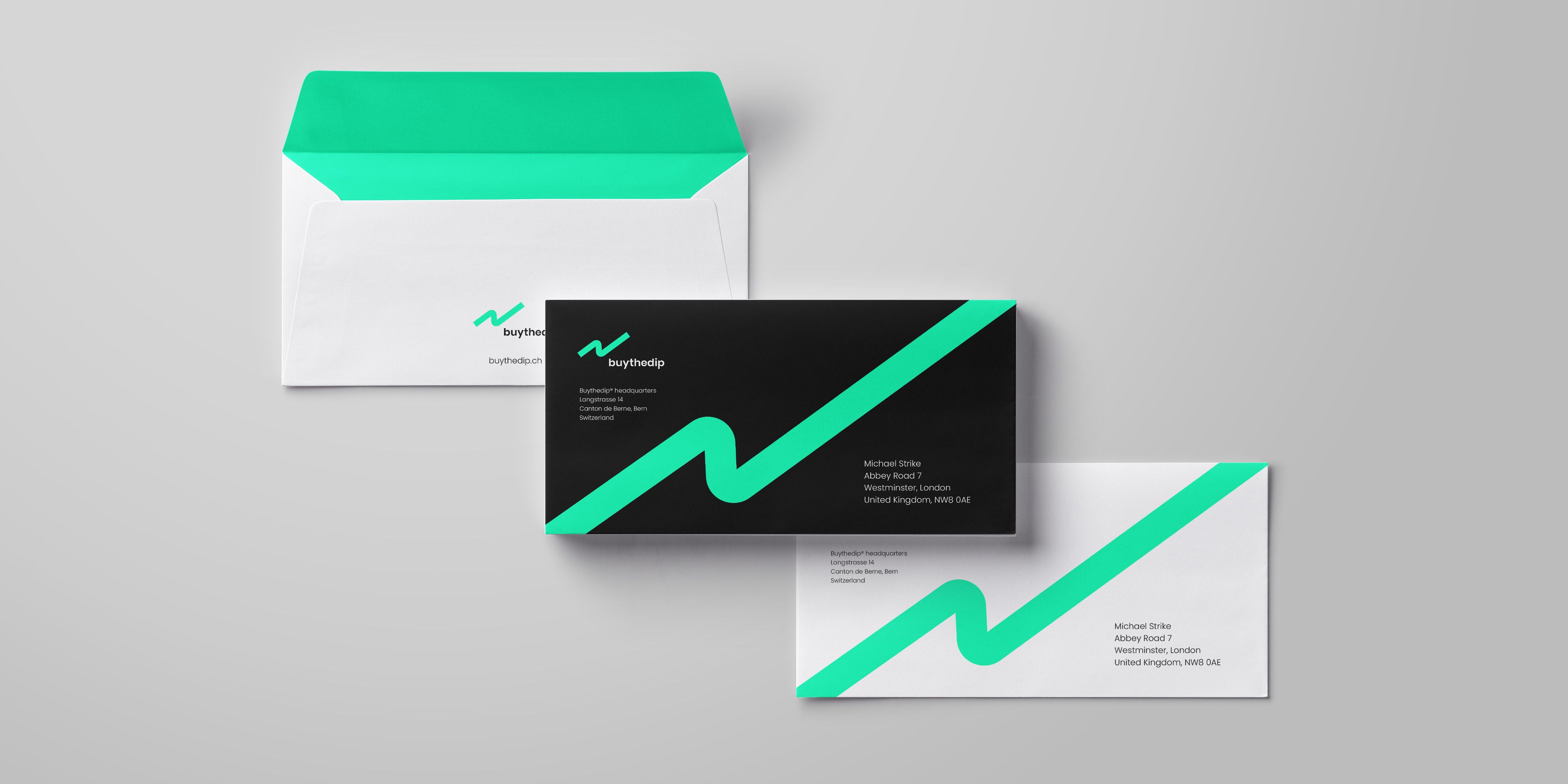
We have developed extensive recommendations for applying the logo across various contexts. Our guidelines include specific instructions for using the logo on marketing materials, product packaging, corporate merchandise, and digital platforms. This ensures consistency and enhances brand recognition across all touchpoints.