- works
- DoNotMarketing
DoNotMarketing
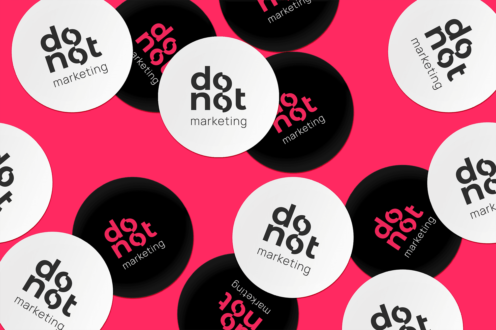
"Do Not Marketing" is a marketing agency whose name sends a clear message: Don't try to do more than you can handle—trust the real professionals. The company approached us to create a powerful and recognizable brand.
The name of the agency "Do Not Marketing" intriguingly derives from the childhood nickname of the company's owner—"doughnut," which her father transformed into the Anglo-Saxon "donut." A creative letter shuffle turned this into the meaningful "do not." The result? A stylish logo, a powerful corporate identity, and the sweet satisfaction of a job well done.

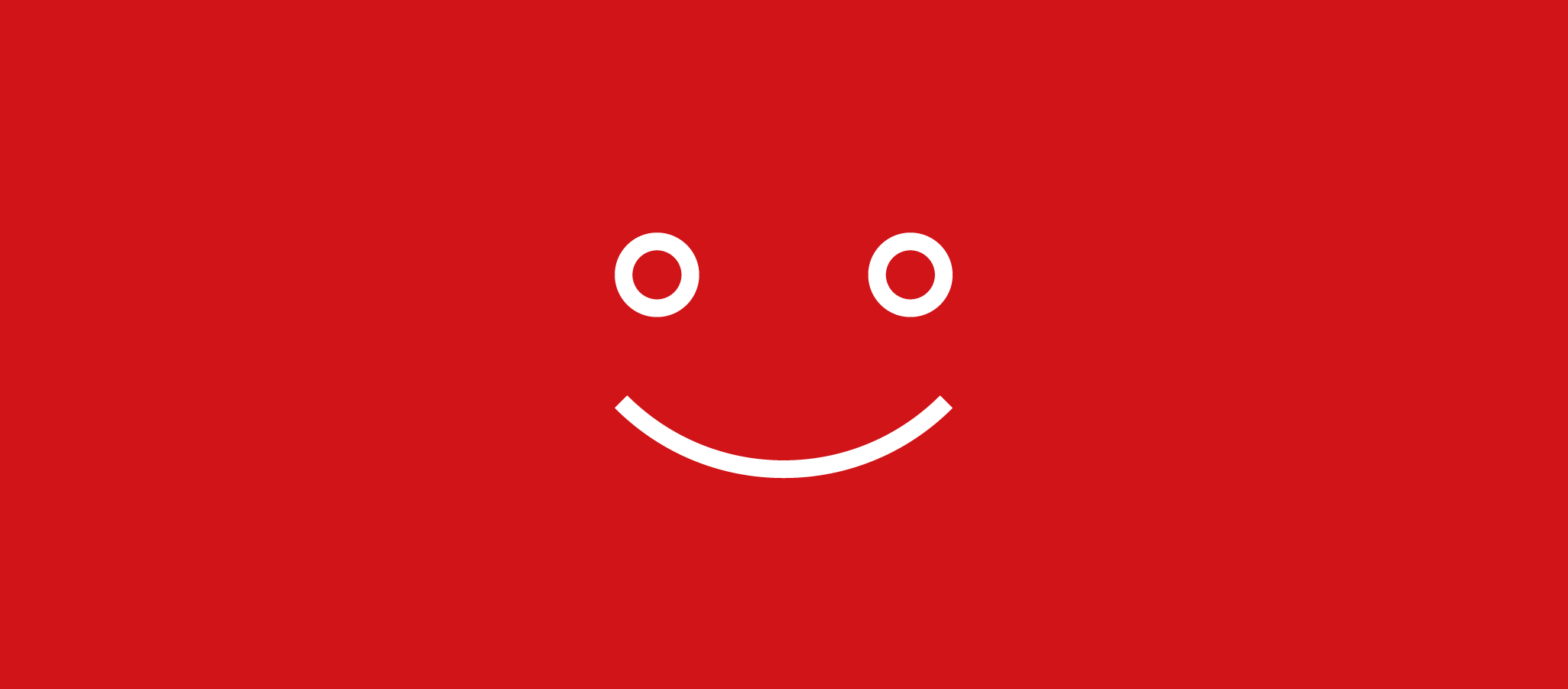
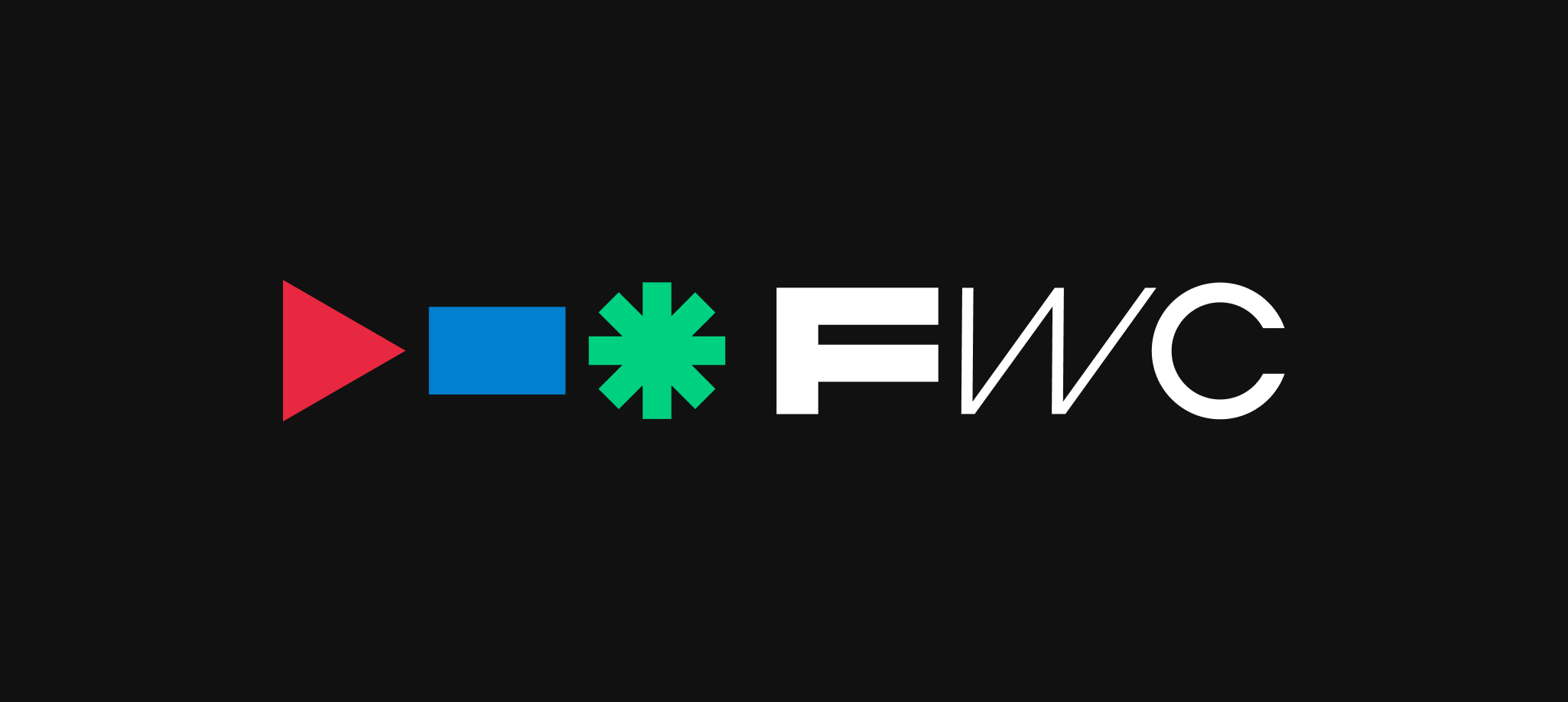
The "Do Not Marketing" logo was meticulously designed to reflect the brand's philosophy: simple yet expressive. It features a minimalist design that balances elegance and playfulness, symbolizing the agency's professionalism and creative approach. The elements used in the logo, such as clean lines and contrasting colors, not only enhance its recognizability but also evoke a sense of trust and confidence in clients.
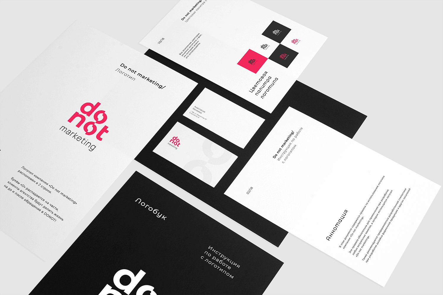
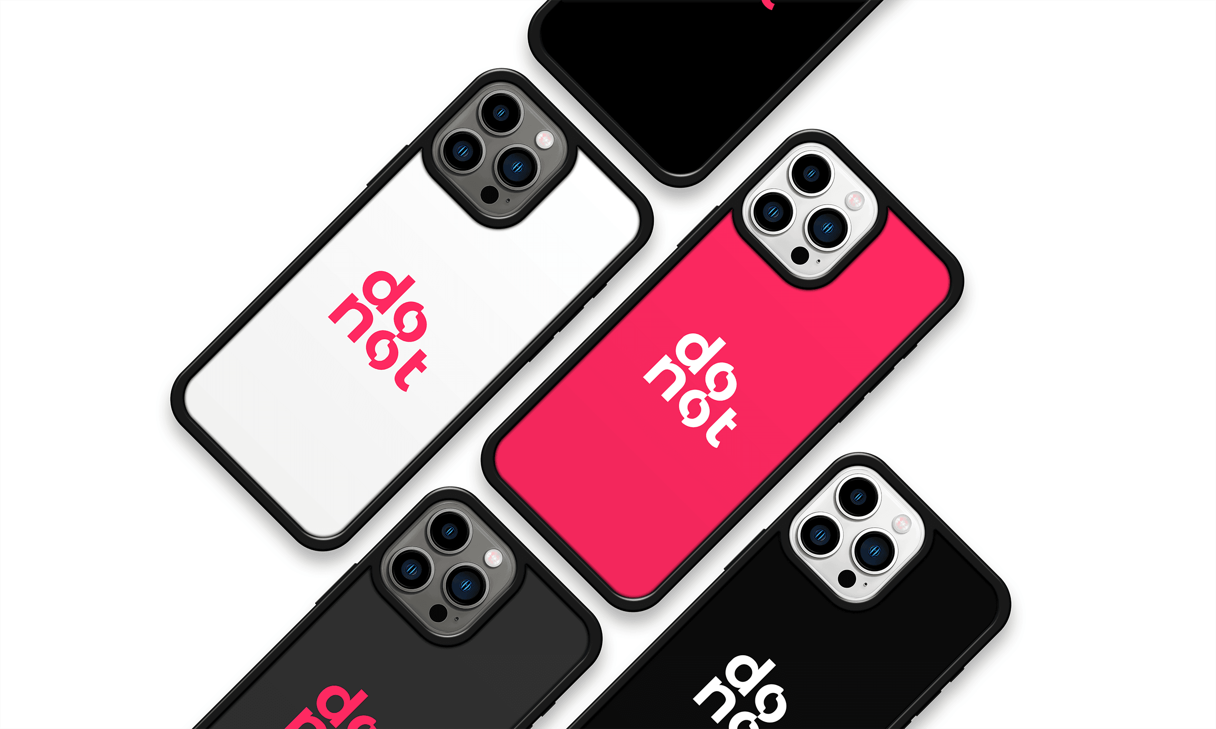
This is a memorable design that allows for instant brand identification among competitors. The emotional perception of the logo is aimed at evoking a sense of reliability and innovation, perfectly aligning with the spirit of "Do Not Marketing."