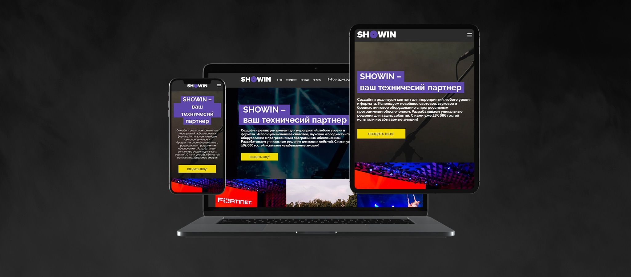
- works
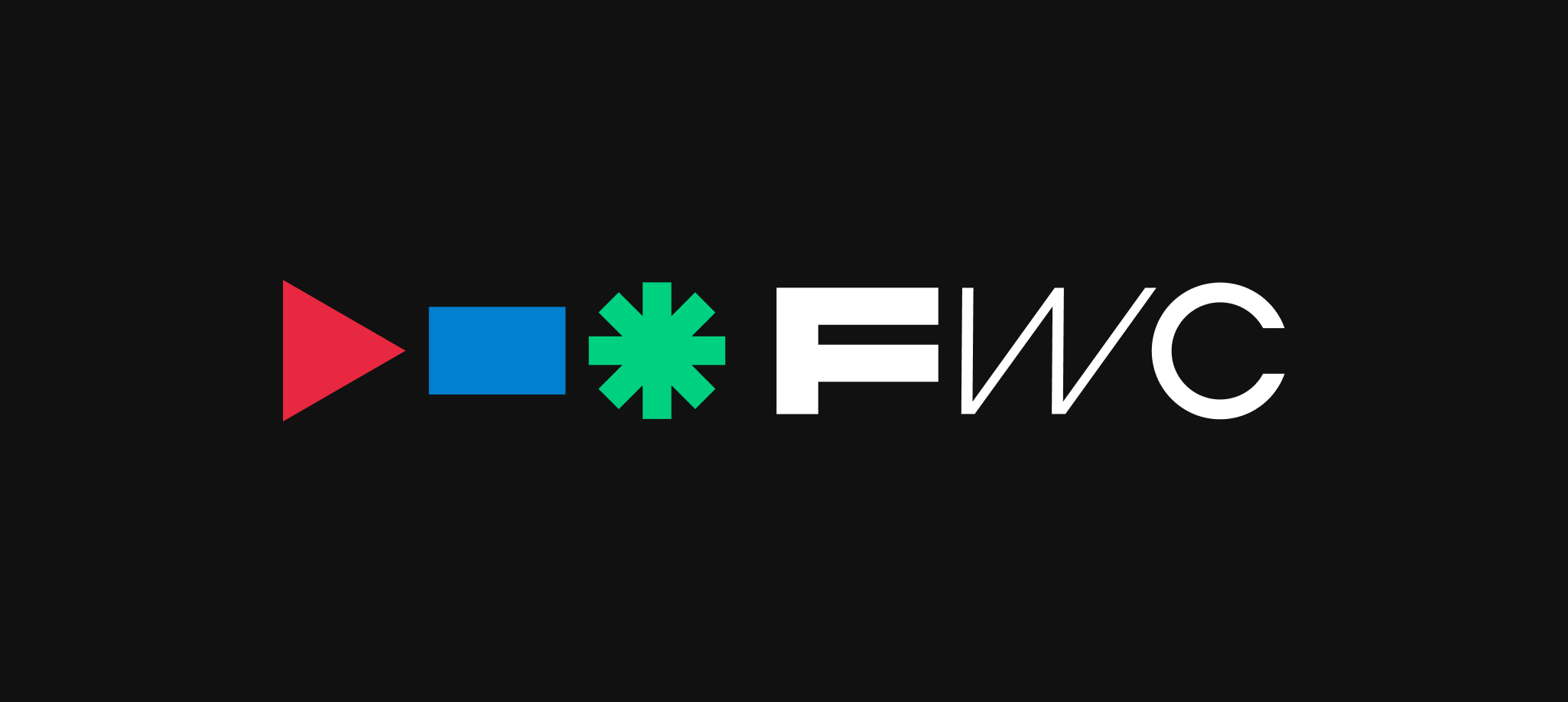
- ArcMe
ArcMe
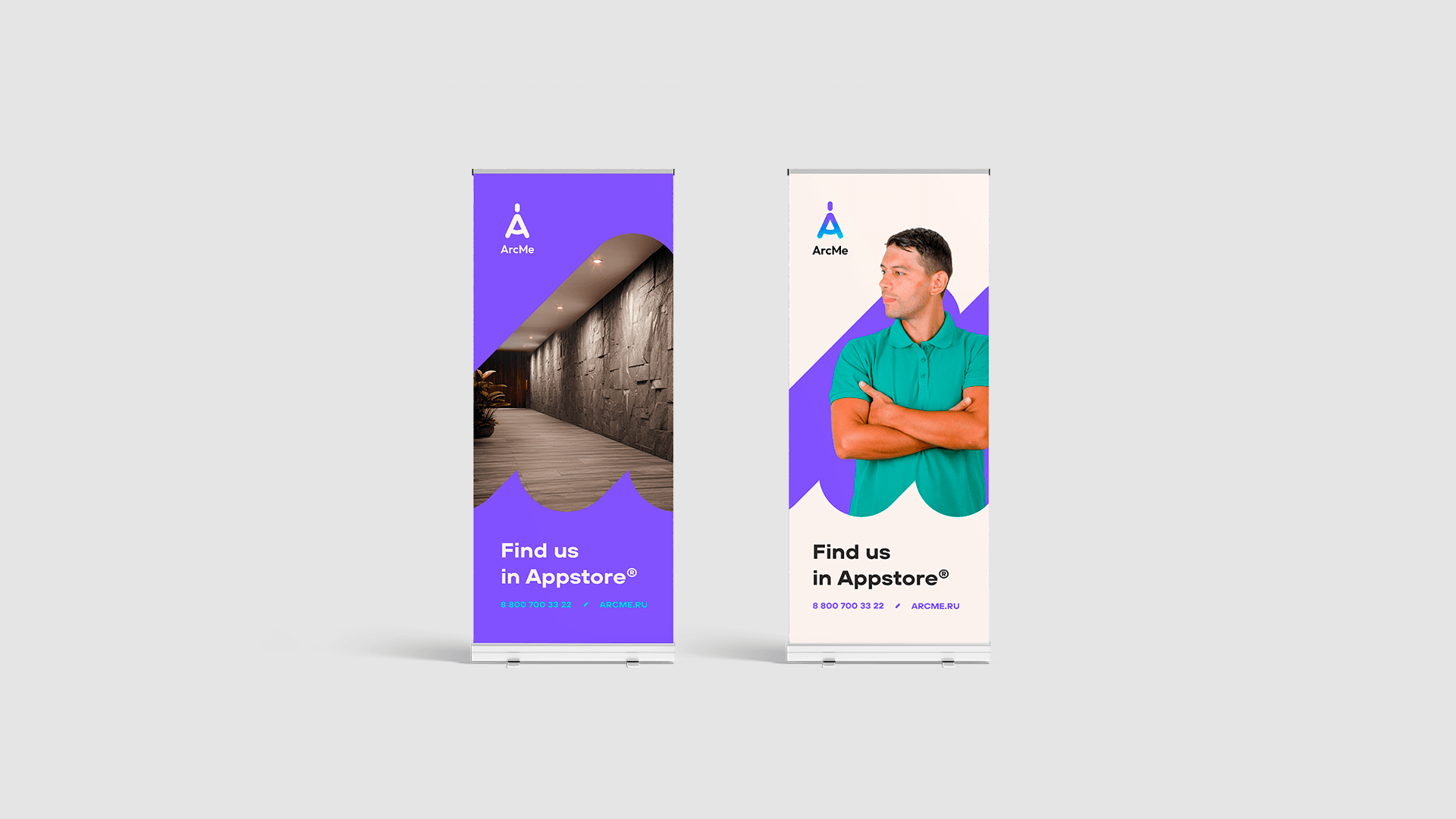
Geometric, symbolic, and as always, stylish — the logo and brand identity for ArcMe. This design emphasizes the company's innovative approach to using modern technologies. ArcMe is an information system for the automated calculation and ordering of stone products with the highest level of automation. The system is designed to simplify the design and manufacturing processes, reducing the time from concept to implementation.
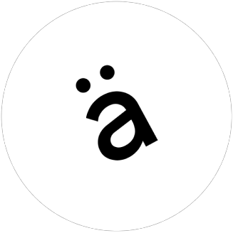
The key element of the logo is a stylized letter 'A' with a vertical bar on top, which powerfully and steadily rises, resembling the shape of a compass. This symbol not only reflects the essence of the company's activities but also its emphasis on precision and reliability, which are fundamental to all processes.
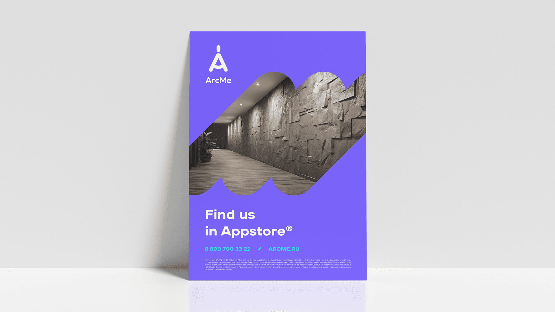
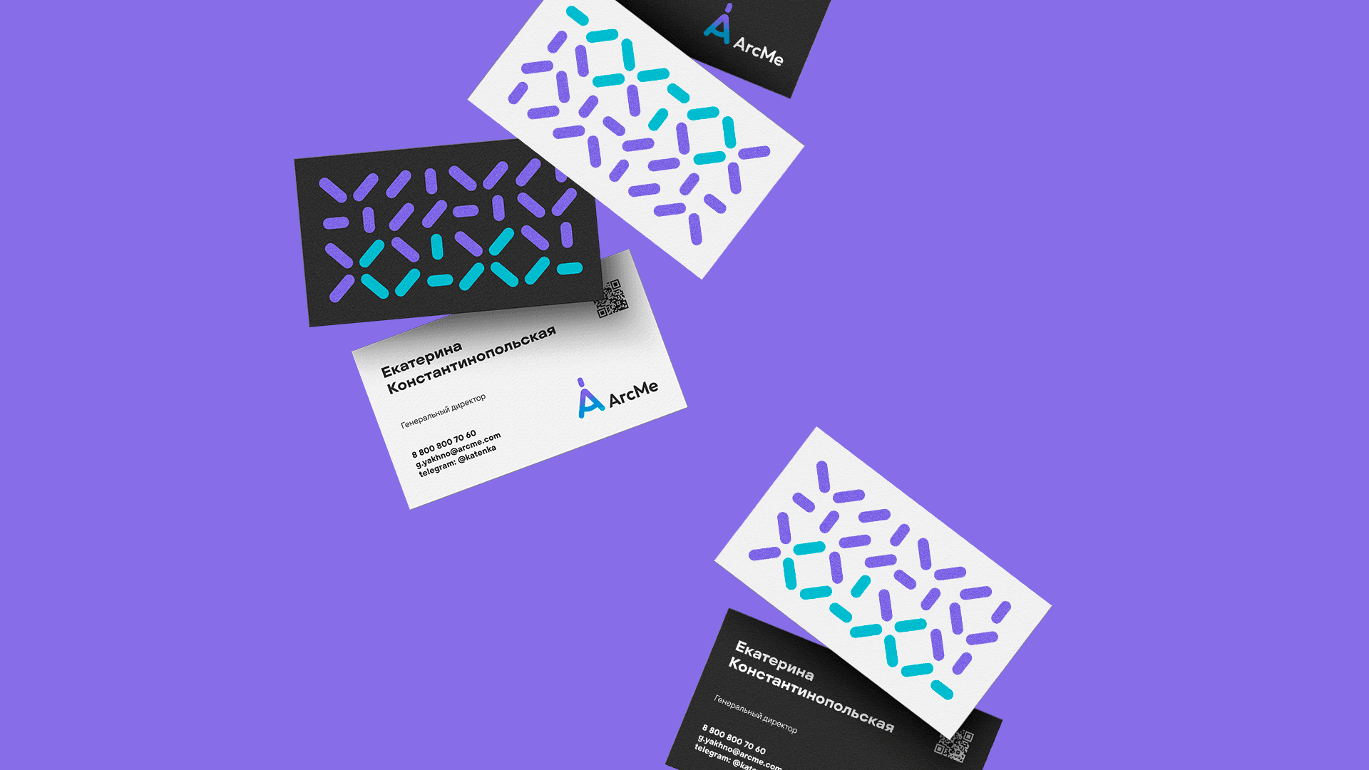
In the brand identity, bright colors, proprietary patterns, and shapes are used, which bring visual dynamism and modernity. The color palette consists of vibrant shades that stand out against competitors and make the brand recognizable.
The proprietary patterns are designed to be scalable without losing quality, making them ideal for all types of media — from digital interfaces to print production.