Yakovlev’s Apiary
How do you create a logo that not only reflects the essence of a business but also captures attention and stays memorable? The process of developing a logo for Yakovlev’s Apiary, a company specializing in honey production, became a true story of building a brand confident in its product. Through a careful selection process among numerous options, a vivid image was born — one that embodies confidence and craftsmanship.
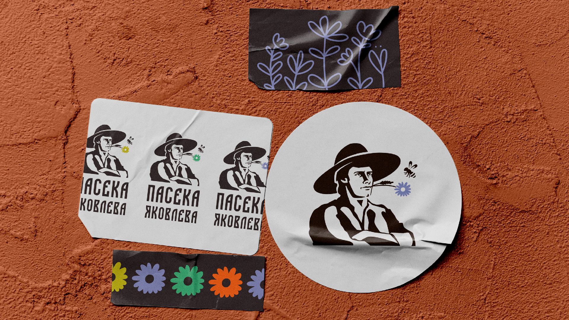
At the initial stage, the designers were tasked with conveying the company’s unique spirit through the logo. A series of concepts was presented — seven original sketches, each attempting to capture the essence of the business. Among them stood out an illustration of a confident, experienced man, whose facial expression and posture conveyed the resilience and wisdom gained over the years.
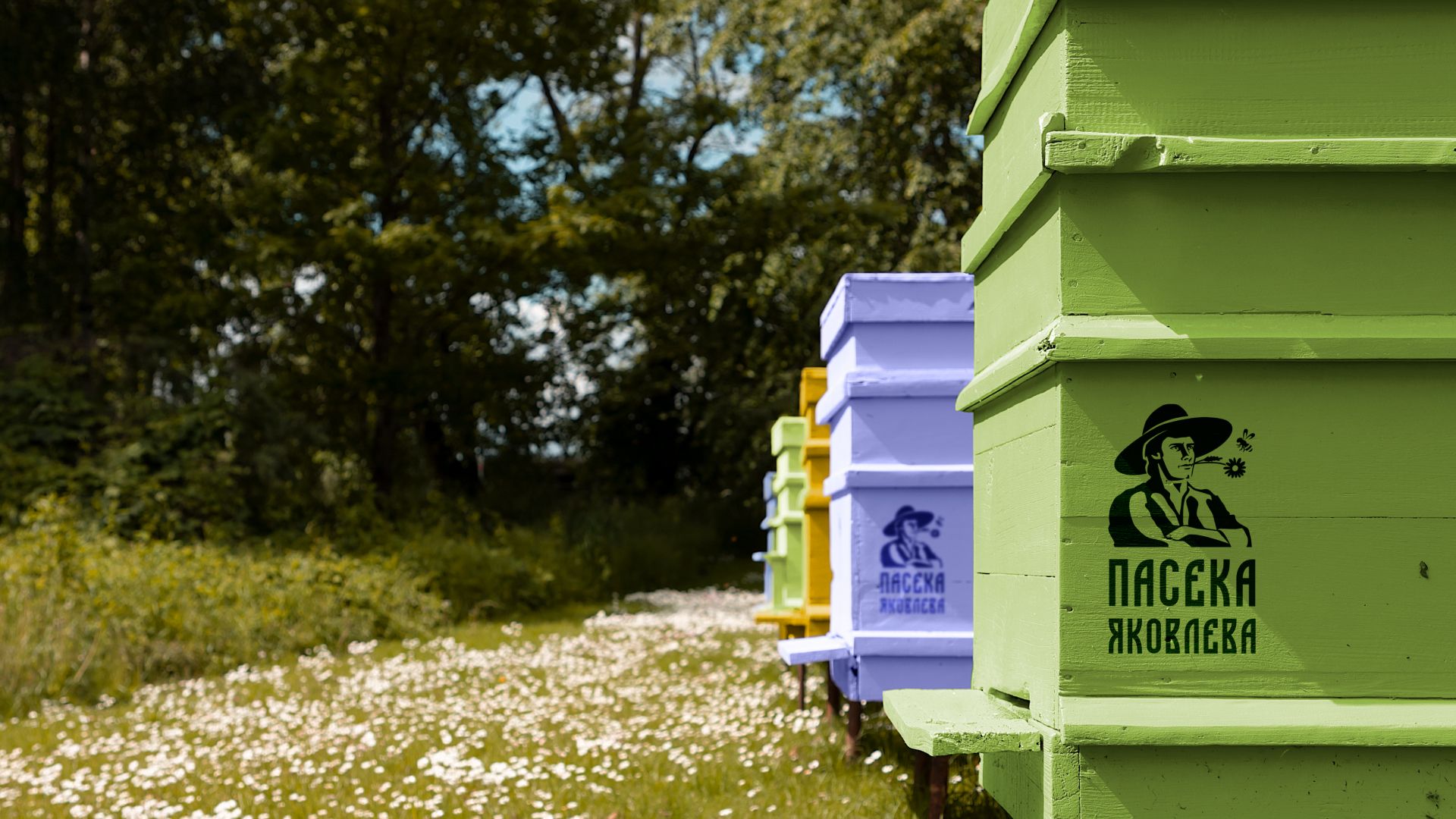
After thorough discussions, the team and the company’s founder decided that he himself — with his charisma and distinctive appearance that instantly draws attention — would become the face of the logo. His confidence and striking presence emphasize the quality and authenticity of the product.
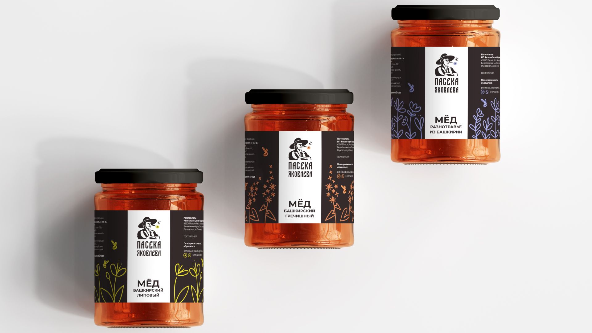
The next step was the creation of a detailed logobook and honey labels. These elements became an essential part of the corporate identity, setting the guidelines for applying the logo and visual elements across all mediums — from packaging to marketing materials. Thanks to the logobook, every design layout maintains a consistent style and conveys the company’s atmosphere.
The process of developing the logo and brand for Yakovlev’s Apiary was not just a completed task, but an inspiring step toward building a recognizable and self-confident brand. Now, when customers see the familiar image of the founder on the shelf, they immediately know they are choosing genuine honey — made with soul and a true love for the craft.